Digital imaging:
In this post i will be showing different types of images that I think that look good and how the picture has been used digitally and created, these images will be edited from start and the colour and effects that have been added into them. I will be explaining why I like these images.

I like this First image because of the way it is designed,
the colour's and effects within the image.
Stratzeh has used the pen tool over the Stratz
text to get that purple line effect. The colour's he has used with this image is that he's gone with a green, yellow, brown and blue. The gradient to split the brown and the blue with the green in the middle.
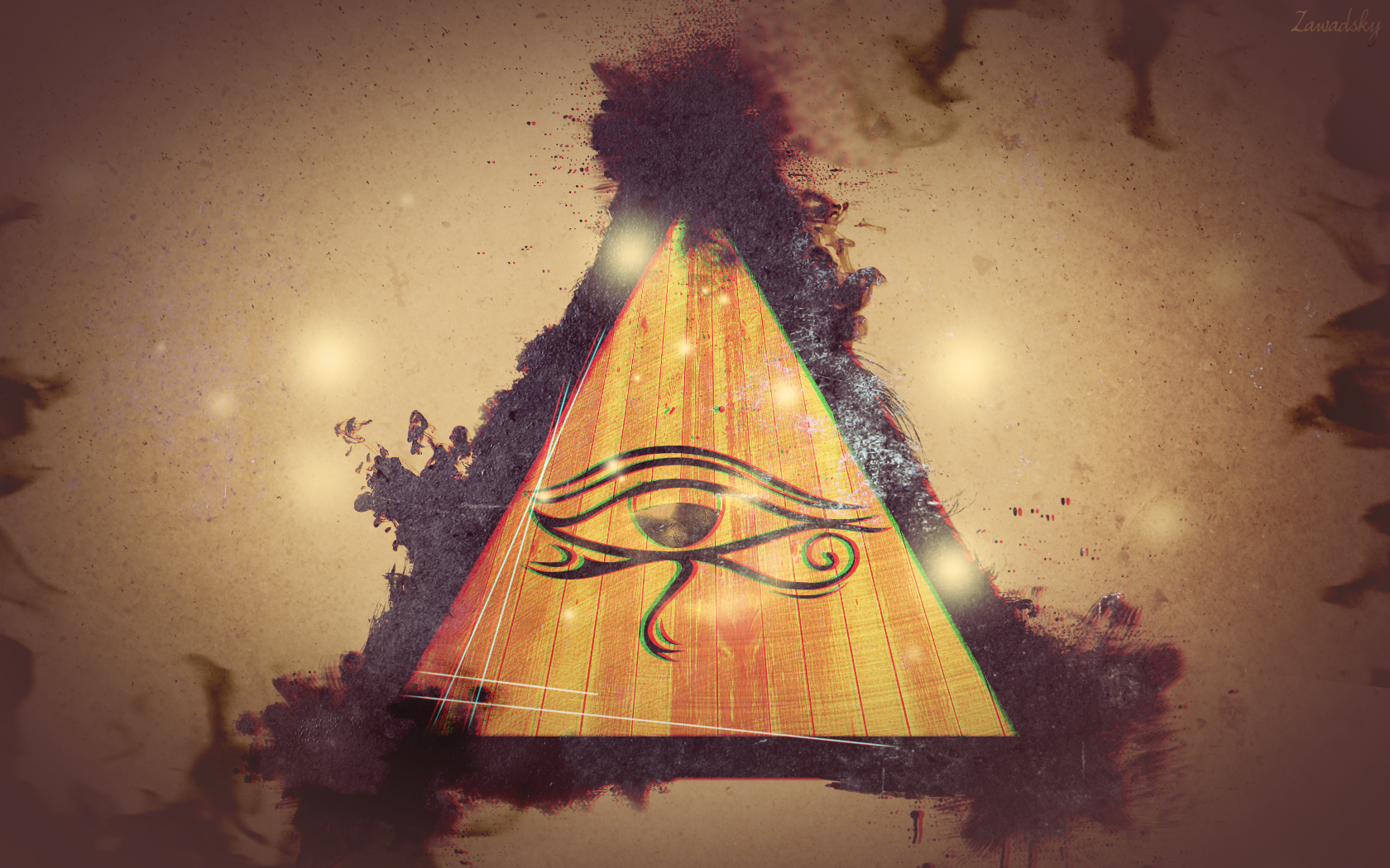 In this second image I like how he's mixed the colours together with the beige and the purple/ brown on the outside of the triangle, he's copied the triangle and make them 2 separate layers so he can overlay them on top of each other. He's darkened out the edge of this image to lighten up and brighten up the colours in the center. This image is very creative and I like how to colour's match.
In this image he has made the sunset in the center of
the image and with the light lighting up the flower's and the colour shade coming from behind the tree's on the left side. The sunset brings out the flowers more and makes the shading and the positioning more creative.

In this 4th image he has used the tree's to split off the water and the sky, i like how the colour is added into this image when it splits off. I like how the biggest tree's are placed in the center and gradually get smaller along the big tree's and then bigger at the edges.